Marigold
Client: Marigold
2026
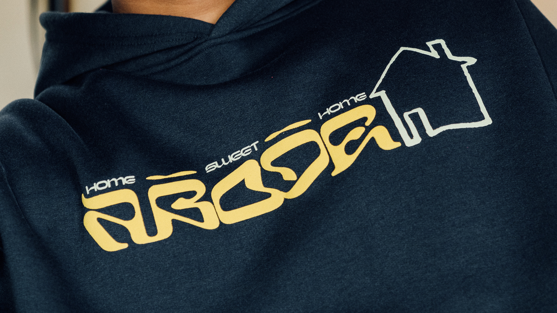
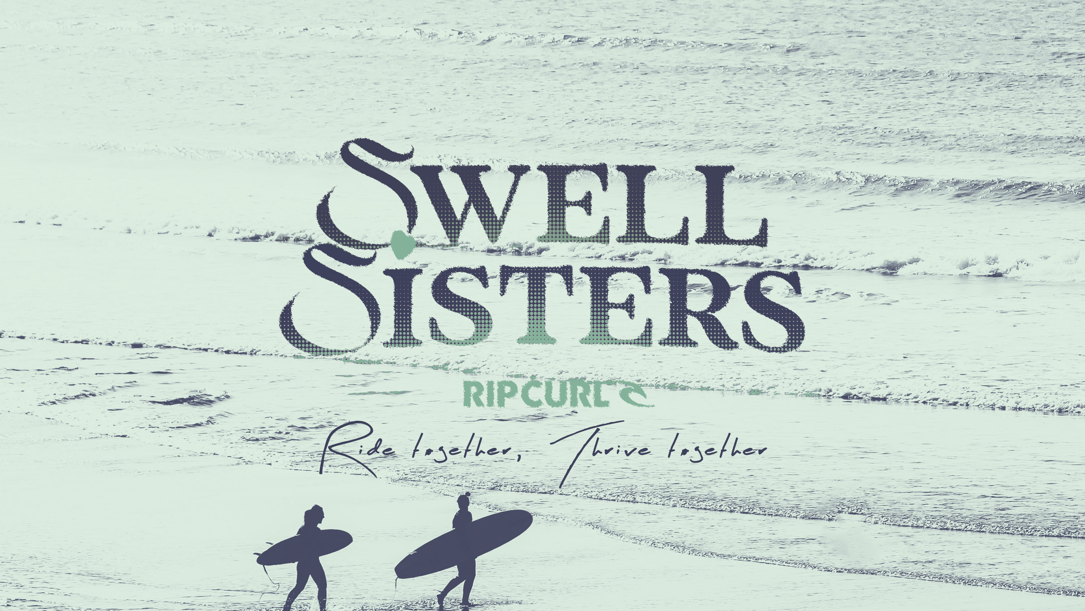
Previously operating as B2B, the brand had built real momentum, but their identity no longer reflected where they were heading. The name, tone and visual language still reflected an earlier stage, limiting how the brand was perceived as it expanded. The brand had outgrown it’s own framework.
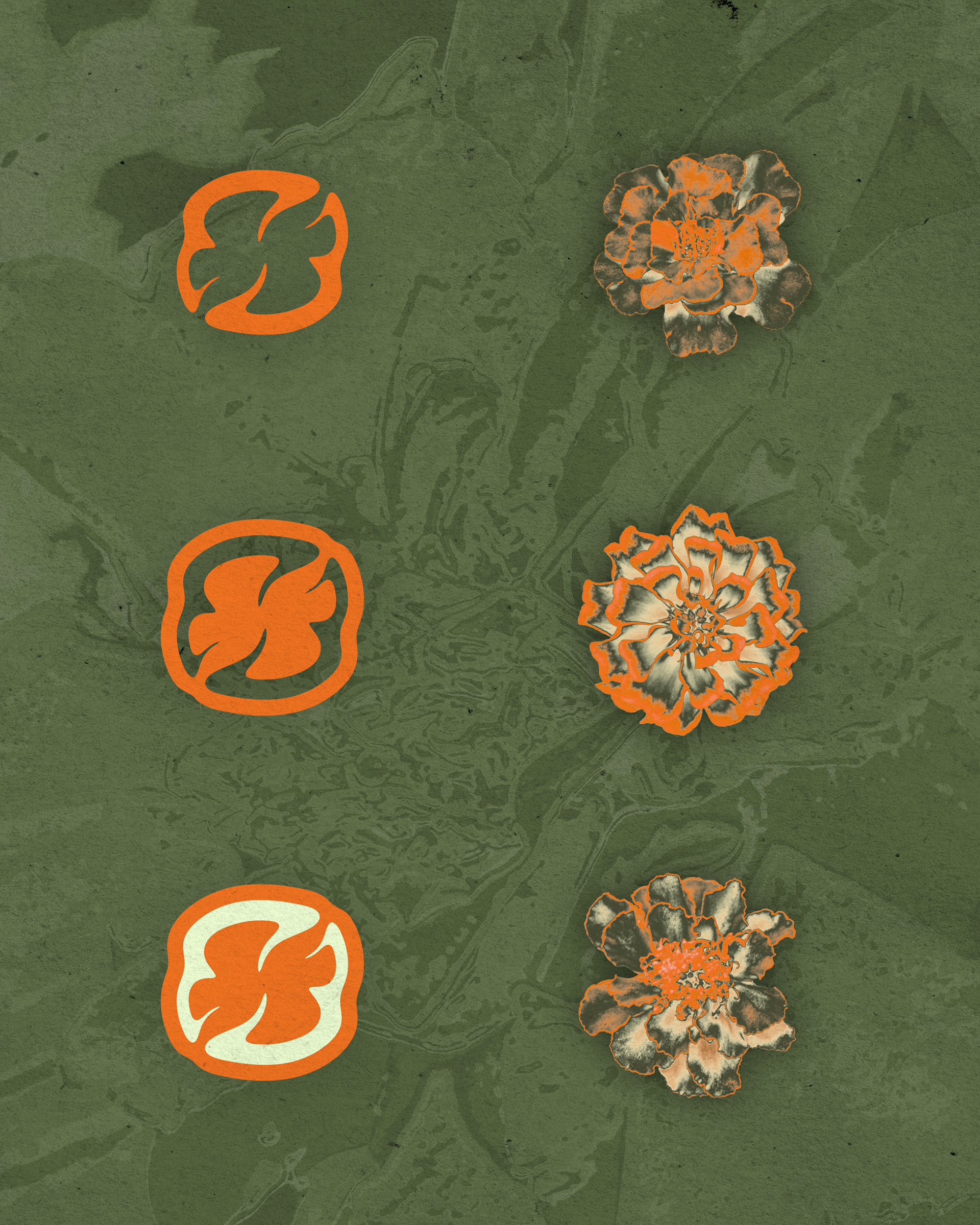
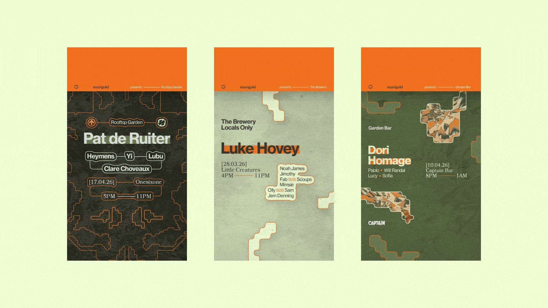
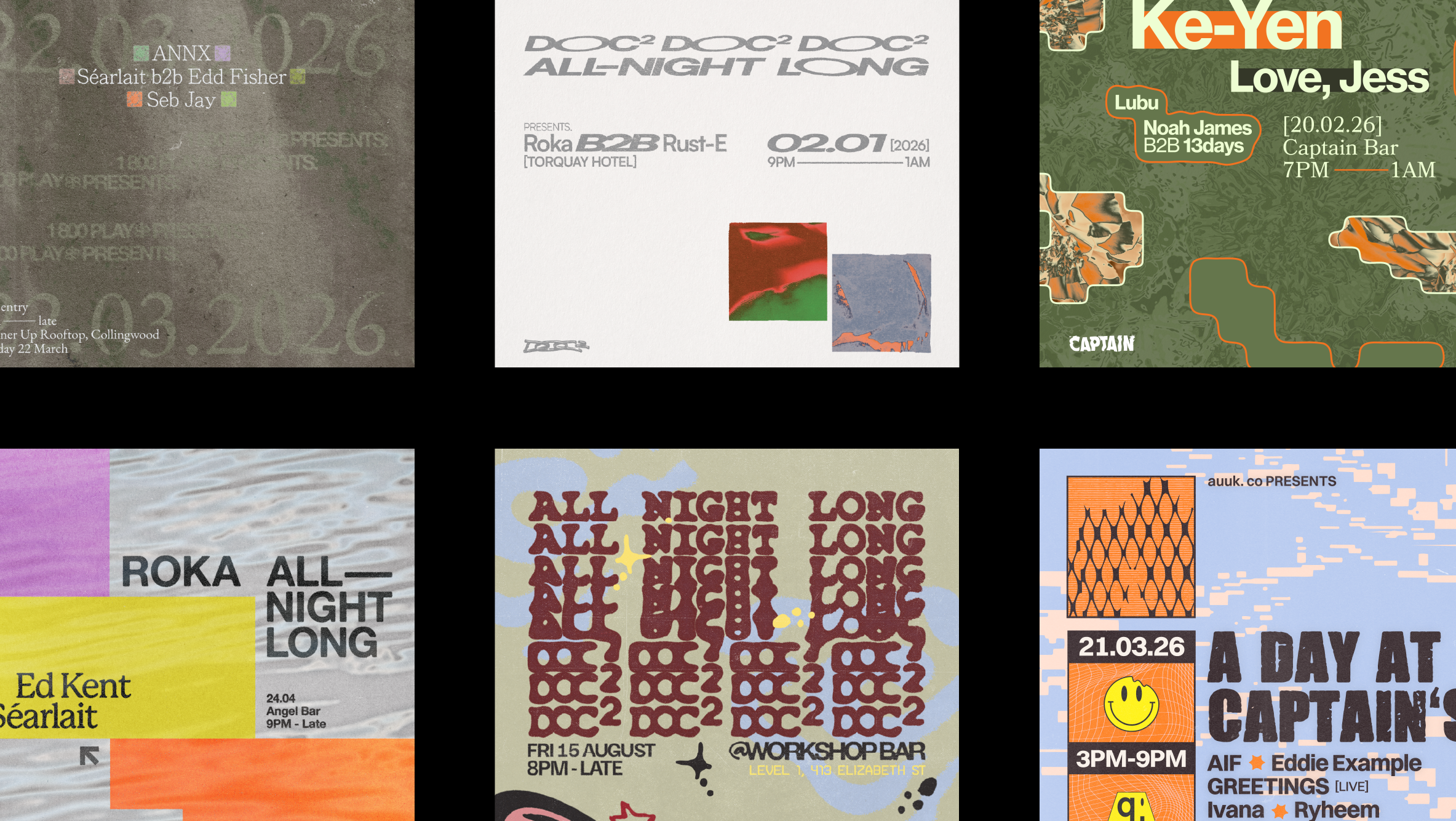
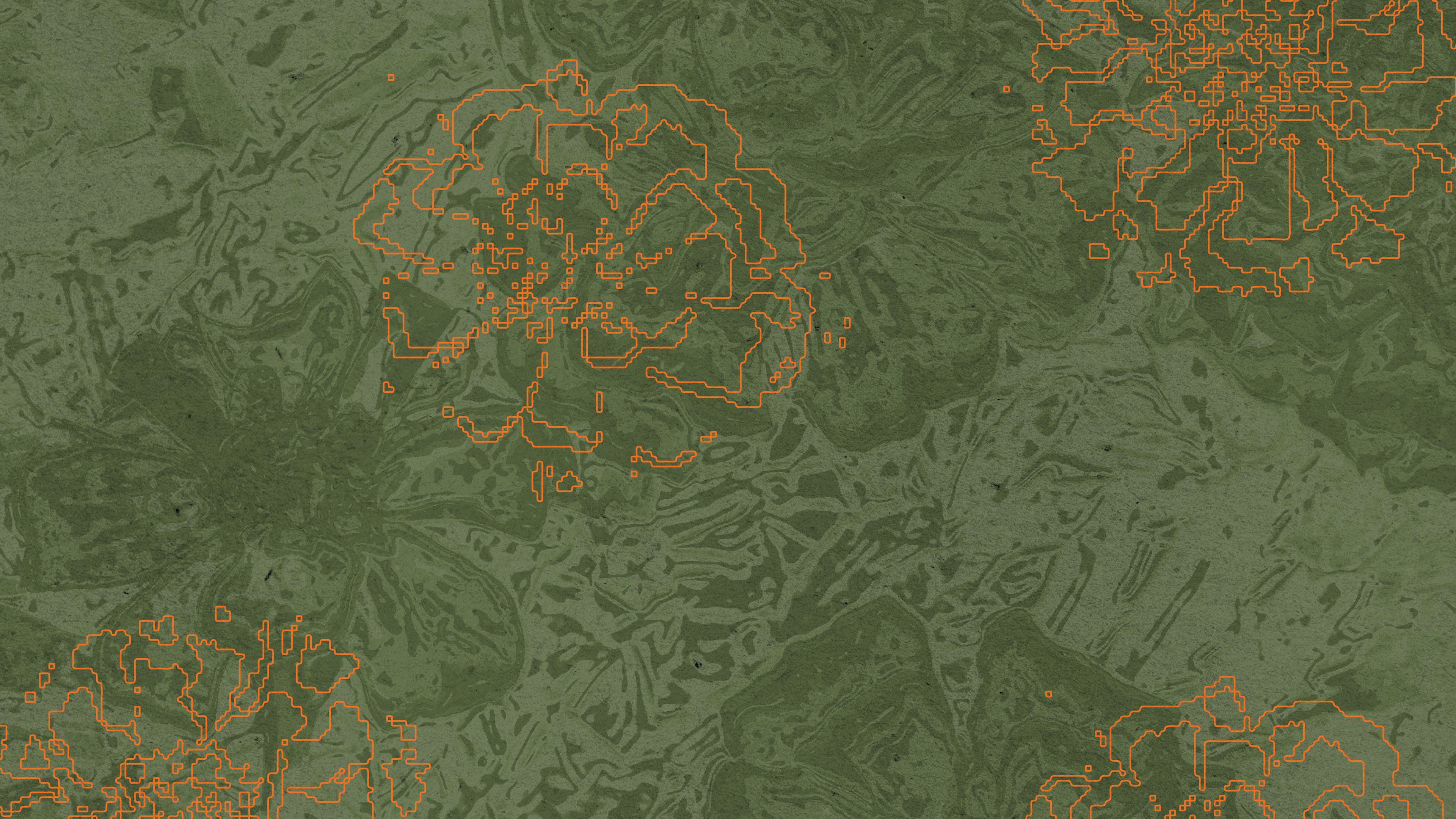
Rebranding to Marigold marked a deliberate shift forward. A cohesive identity system was built to connect the brand’s origins with its future direction, ensuring clarity across every touchpoint. From the logo and symbol system through to textures, motion, and graphic elements, every component was designed to interact within a unified visual language.
The result is a brand that shows up with clarity and consistency, strengthening its presence across events, content, and collaborations, and positioning Marigold for sustained, culturally relevant growth.